
 What is price action? Price action, based on how I conceptualize it, is simply the actions of other traders and institutions in the market, displayed visually through the use of charts. The actions of these market participants, which can include buy and sell orders, cause the movements in price. More buy orders than sell orders lead to an increase in price. More sell orders than buy orders leads to a decrease in price. It is very important to understand that no matter what currency or stock chart you are looking at, the price action it is representing is the outcome of HUMAN behavior. Humans who act based on the two main emotions found in the market, fear and greed. Based on this fact alone, we can then expect patterns to emerge which will repeat themselves. A successful trader will have their own way of seeing these patterns and acting upon them.
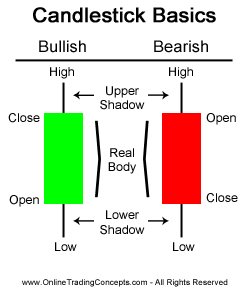 So now that we understand that all of these various charts are simply the depiction of buy and sell orders (order flow), I can now explain how charts physically display this information. When looking at the various types of charts, candlestick charts are my personal preference. I believe they display all the necessary information to understand the order flow I’ve been talking about. A candlestick shows the open, close, high and low of price during a specified period of time.
When looking at any candlestick, it will be either a bullish candlestick (green) or a bearish candlestick (red). Bullish means that price closed higher (buyers > sellers) and bearish means price closed lower (sellers > buyers). Please keep in mind these colors can change and are meant to apply specifically to the image I’ve posted. The body of the candle shows the difference between where price opened and closed, or the net difference in price. The shadows, also known as wicks or tails, show the entire range of price movement for a period of time. When you’re looking at a shadow, you can think to yourself: “Price moved as high as the top of the upper shadow, price moved as low as the bottom of the lower shadow.” So based on this example, let’s say that for the bullish candle the open price was $5 and the close was $7. The upper shadow has a high of $9 and the lower shadow has a low of $3. Based upon this candle we can determine a few things about order flow for this period:
- Price opened at the start of the period at $5 and due to the presence of more buyers than sellers at the end of the period, price was able to move higher and close at $7.
- Price attempted to move as high as $9, but due to an excess of sellers or a lack of buyers, it was pushed back lower.
- Price attempted to move as low as $3, but due to an excess of buyers or a lack of sellers, price was eventually pushed back higher.
Once again, I would like to remind you that these candlesticks are representing human behavior, whether they be individual retail traders or large institutions. With this basic understanding of how to read a candlestick, I would suggest going to a chart and look at a couple candles. Can you determine which side of the market is winning the battle during each period of time? Is one side showing dominance over the other? Does it seem even? These are questions you will have to begin asking yourself.
